
What is a Pivot Table?
- Joanne @ Paramount

- Mar 21, 2023
- 3 min read
Updated: Apr 5, 2023
The beauty of pivot tables are that they allow you to summarise and analyse data at a high level, quickly and easily. Whether you want to know…
How many products you sold last year
What your top selling product is
Which sales person performed the best
Historically, what your best time of year for sales is e.g. Quarter 2 or every September
Pivot tables are a fantastic tool to help you gather this information.
So, how do I create a Pivot Table?
To create a pivot table, firstly click anywhere within the data range. Click the PIVOT TABLE button on the INSERT tab and click OK.

A new sheet has been created for the pivot table. The raw data remains unchanged.

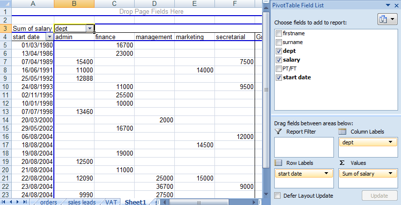
You can now drag items from the ‘Choose fields’ section on the right, across to the table on the left – in the example below, ‘dept’ has been dragged across to the area labelled ‘drop row fields here’.

Drag a second field to the ‘drop column fields here’ area. The example below shows PT/FT in the ‘column fields’ area i.e. categorising staff as to whether they are full or part time.
Finally, drag a third field across to the ‘drop data items here’ area. In the example below, salary has been used:

You can now see that the summary information is separated out into departments and whether the staff members work full or part time (FT/PT). If you then wish to change the pivot table, you can simply drag back any item to the right-hand panel and drag back in an alternative value e.g. click on ‘dept’ in cell A4 and drag it back to the ‘choose fields to add’ area on the right.
Viewing sum/count/average figures
By default, the salary figures are summarised using a ‘sum’ function, but this can be changed if required. Right click on the ‘sum of salary’ cell and then click ‘value field settings’.
Pick the required option from the list e.g. ‘count’ and then click OK. A count summary is now displayed:


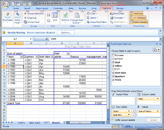
How do I break down the data by date/month/year etc.?
If you want to compare one period with another, then try this!
In the following example, ‘start date’ has been placed in the ‘drop row fields here’ area, but we can make the data more useful, by summarising it by month/year etc.
To do this, right click on one of the dates in column A and then click GROUP:
Pick the items in the list to determine what is displayed e.g. months/quarters/years, and then click OK.

How do I know which section my data goes in? (we hear this question A LOT!!!)
There is no right or wrong way to arrange your data, but typically, if you have a column in your raw data which has lots of different things in it, then put it in the ROWS section. E.g. you might have...
35 sales staff
13 different departments
107 different products
21 different schools you visit
Similarly, if you have a column in your data with only a handful of variations in it, then it could be better in the columns. E.g. you have...
3 different payment or order statuses paid/unpaid/unhold
4 different main categories of product e.g. toys, books, games – each of which is likely to contain tens or hundreds of individual items
Staff training might be ‘attended’ or ‘failed to attend’
You will definitely want to add something to the values section however.
The filters section is good to narrow down your data if you have too much. E.g. if you wanted to…
• Look at the sales of one specific product
• Find out how many staff attended one specific course
• Discover how many IT helpdesk issues have been ‘resolved’ versus ‘still outstanding’.
Still stuck? Contact us to book a half day training session dedicated to pivot tables, or a full day if you’d like to cover additional topics too!

Comments